Your 11-Step Checklist for Creating Print‑Ready Files
Preparing design files for press isn’t glamorous, but it’s the single most effective way to avoid blown budgets, missed deadlines, and embarrassing color shifts. Follow the ten steps below, paying special attention to custom die lines and imprint zones, and you’ll hand your printer a package they can send straight to plate without costly back‑and‑forth fixes.
Every production floor has a graveyard of reprints that could have been prevented with tighter prepress discipline. Missing bleeds, low‑resolution photos, hidden RGB objects, and stray dielines all introduce risk. The checklist that follows distills industry best practices into a repeatable workflow you can apply to brochures, packaging, signage, and any other printed piece. Master these steps and you’ll deliver files that run cleanly through preflight, hit color targets on press, and arrive on time, every time.
1. Know Your Project Specifications
Start by collecting the hard facts about the job:
- Final size and orientation – Confirm trim size, folding scheme, and pagination so your layout grid, panel widths, and margins are accurate from the first artboard.
- Paper, coating, and binding – Stock thickness affects fold tolerances and scoring as laminate, aqueous, or UV coatings can slightly alter color density. Knowing the materials informs your color builds and whether white ink or an opaque underprint is required.
- Specialty techniques – Embossing, foil stamping, varnish patterns, or laser cuts all require extra separations or spot channels. Calling them out now avoids a domino effect of edits later.
- Printer guidelines – Ask for the shop’s preferred PDF/X preset, bleed dimensions, and die‑cut templates. Building to their exact specs dramatically reduces prepress chargebacks.
Treat this data as your creative brief. Lock it in writing i.e. an email thread, shared spec sheet, or job ticket, and reference it whenever scope creep threatens to derail the schedule.
2. Choose the Correct Color Mode (CMYK vs. RGB)
Monitor displays and phone screens glow with additive RGB light, but presses deposit subtractive CMYK pigment. Any RGB element left in your file forces the RIP (Raster Image Processor) to guess a conversion, often clipping saturated blues and reds.
- Design directly in CMYK – to design in CMYK for print, you must set your design software’s document color mode to CMYK from the start (before importing assets), manage your colors using CMYK values, and export the final file with a suitable CMYK color profile embedded. This ensures the colors you see on screen are a closer representation of the final printed product.
- Convert external files – Logos or photos sourced in sRGB must be converted to CMYK, then visually checked for shifts.
- Assign spot colors early – If corporate guidelines specify Pantone 186 C, add that spot swatch at the beginning, not 30 minutes before the deadline.
Keep a calibrated monitor and hard‑copy swatch book on hand since your eye is still the final test of whether the digital preview matches customer expectations.
3. Work at the Right Resolution
Pixelation is forever. Interpolating a 72 dpi web graphic up to 300 dpi may pass a software check, but it can’t conjure detail that never existed.
Recommended resolution at 100 % size
- Continuous‑tone photos: 300 dpi
- Line art or 1‑bit graphics: 600 to 1,200 dpi
- Vector logos/illustrations: Infinite (keep vector paths)
If the only source file is low‑res, ask for a replacement or recreate it as a vector. Modern AI upscalers can help in a pinch, but they’re not a license to ignore good asset management.
4. Build In Adequate Bleeds
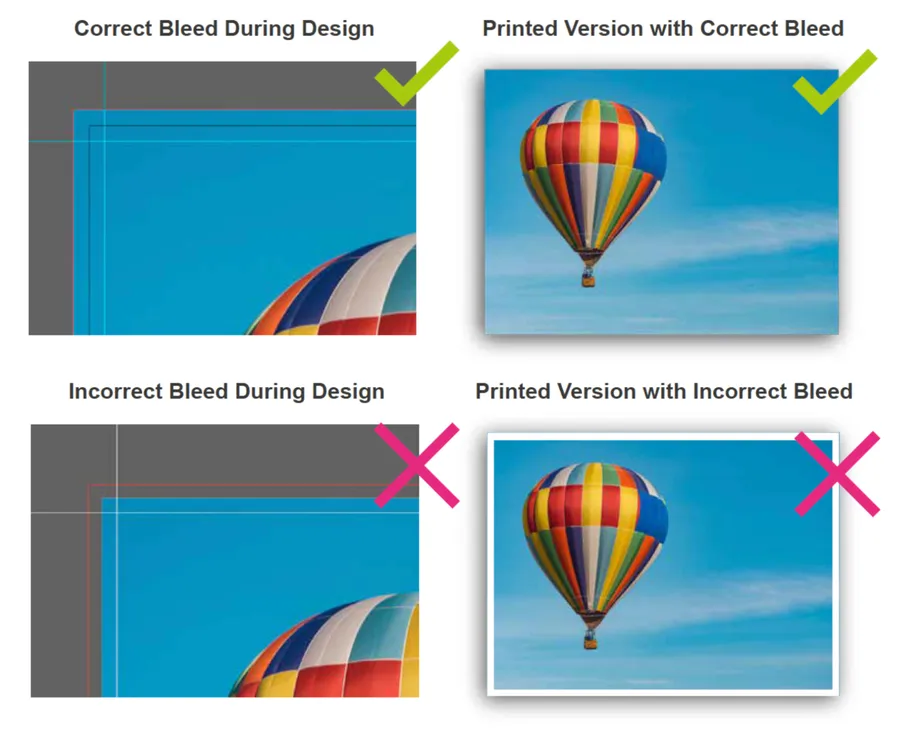 Ink and paper don’t stop on a dime. Sheets can drift as they travel through cutters and folders. A proper bleed masks that movement.
- Extend backgrounds 0.125 inch (3 mm) past the trim on every edge. Some wide‑format or packaging presses need even more so verify with your vendor.
- Keep bleed on its own layer labeled “BLEED – DO NOT TRIM” so it’s easy to toggle during proofing.
- Include bleed guides in the final PDF and soft proofs so approvers understand what will be removed.
Never substitute a white border for a bleed unless the design truly intends a framed look.
5. Plan for Custom Die Lines & Imprint Zones
Complex pieces like folders with curved pockets and panels, packaging with tuck flaps, brochures with stepped panels all live or die by accurate dielines. Misplace artwork by a hair, and the finished piece will reveal white slivers or cut through type.
According to Vladimir Gendelman, CEO of the presentation folder print shop CompanyFolders.com which offers a free prepress artwork review as part of their quality control guarantee, “the three errors that derail these most often are missing bleeds on secondary panels, text placed into the imprint area, and dielines left active in the final prepress PDF. The fix is simple but non-negotiable: keep the dieline on a clearly labeled, non-printing layer, push your bleeds a full 0.125 inch past every cut, and pull type or logos at least 0.375 inch inside the safe zone. Follow these tips and you’ll save everyone in the pressroom from expensive surprises, since many other printers do not offer free artwork checks like we do.” Adhering to these guidelines, found step‑by‑step in his Print‑Ready Checklist PDF, eliminates the headaches that surface when intricate cuts don’t align with the artwork.
Best practices
- Request the print template or dieline layout before you open Illustrator. Align your artwork to it.
- Label the dieline layer “DIE LINE – DO NOT PRINT,” set stroke weight to 0.25 pt, and apply a spot color named “Dieline” set to overprint.
- Separate imprint areas (glue flaps, business‑card slits, varnish knockouts) onto their own non‑printing reference layer.
- Check pocket overlaps by printing and hand‑assembling a dummy as screenshots don’t reveal inside angles or hidden tabs.
6. Respect Safe Margins & Trim Size
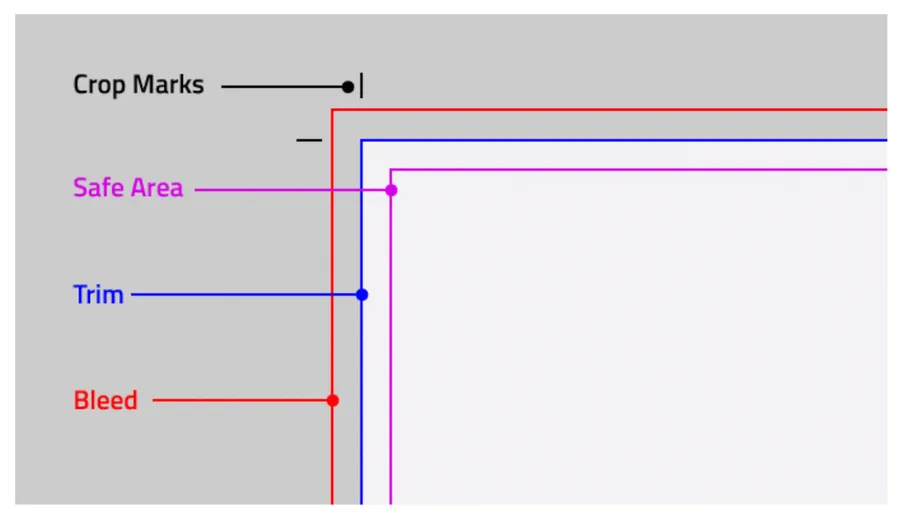
Bleed protects the outside. Safe margin protects the inside. Anything critical like logos, addresses, legal disclaimers, etc. should sit at least 0.25 inch (6 mm) from the trim. Increase that buffer on small products like business cards, where even a slight shift feels exaggerated.
For folded or multi‑panel pieces, measure each panel’s live area. An asymmetric gatefold may have three different safe zones, and text crossing scores can crack if too close to the fold.
7. Embed or Outline Fonts
Missing fonts trigger automatic substitutions that can destroy a layout. There are two ways to ensure this does not happen:
- Embed – When you export a PDF/X‑1a or X‑4, tick the “Embed all fonts” option. The file size increase is negligible, and the live text remains searchable.
- Outline – Converting type to paths eliminates font dependency entirely. Outline headlines and display type. Keep body copy live so minor edits remain possible. Avoid faux styles and apply the actual bold or italic font instead of a software simulation.
Always package the original font files alongside your artwork in case the printer needs to regenerate plates.
8. Manage Spot & Brand Colors
Spot inks aren’t just for metallic golds. Many corporations specify Pantone bridges to maintain color consistency.
- Define each spot in the swatches panel and name it clearly. For example “Pantone 286 C” instead of “Blue.”
- Keep every spot on its own plate; accidental CMYK objects hiding in a spot layer cause tint shifts.
- Supply printed references (brand guidelines, calibrated proofs) so the press crew knows the visual target.
If cost prohibits running dedicated spot inks, ask your printer to provide the closest CMYK build and secure client approval before locking the file.
9. Flatten Transparency & Expand Effects
Drop shadows, blends, and placed PSDs use live transparency that older workflows may choke on. Flattening them ensures reliable output:
- Export as PDF/X‑1a (which requires flattened transparency) or confirm your vendor accepts PDF/X‑4 with live transparency intact.
- Expand strokes and gradient meshes so stroke width and color stay consistent.
- Purge hidden layers, guides, and unused swatches. These bloat file size and slow RIP times.
A clean document prints faster and leaves less room for interpretation.
10. Package Linked Assets
Your design file is only the conductor. Linked images and fonts are the musicians. Forget one, and the concert falls apart.
- Use “Package” (InDesign) or “Collect for Output” (Illustrator) to copy every linked file, font, and color profile into a single folder.
- Zip the package before uploading so nothing gets corrupted in transit.
- Version‑lock – Append a revision date or job number so everyone knows they’re working from the same master.
Cloud transfers are convenient, but include a checksum or MD5 hash for mission‑critical projects so recipients can validate integrity.
11. Pre‑flight, Proof & Export
A disciplined last mile catches 95% of preventable errors.
- Automated preflight – Adobe Acrobat Pro’s Preflight panel, Enfocus PitStop, or your printer’s portal will flag missing bleeds, RGB objects, and low‑resolution images.
- Export with the correct PDF/X preset – If the shop specifies PDF/X‑1a 2001, use it and don’t improvise.
- Proof rigorously – Review soft proofs at 100% zoom, then inspect a contract proof or scatter proof for color fidelity. Sign‑off is the client’s last chance to spot typos or legal misstatements.
Only after receiving “OK to Print” should the pressroom release plates or cylinders. PDF/X‑1a (flattened) or PDF/X‑4 (live transparency). Proprietary formats invite compatibility issues. A minimum of 0.125 inch (3 mm) on all sides unless your printer specifies otherwise. No. Keep the dieline on a non‑printing layer set to overprint and disable it in the final proof. Embed fonts in the PDF export settings or convert them to outlines before packaging.
What file format should I deliver?
How large should bleeds be?
Can I leave my dieline visible?
How do I prevent font substitution?
Conclusion
Print production rewards meticulous designers. By confirming specs, working in CMYK at the proper resolution, building generous bleeds, and treating dielines as sacred geometry, you insulate yourself from most manufacturing surprises. Embed your fonts, police your spot colors, and package every asset, and the prepress team will breeze through preflight. The result will be files that rip cleanly, colors that hit target on the first pass, and finished pieces that reflect the quality of your design without budget‑killing reprints or overnight shipping charges.
Adopt this ten‑step checklist as standard operating procedure, and your next project will flow from screen to press with the precision of a well‑tuned pressroom dance.


