Grayscale vs Monochrome Printing and Photography: What are the Differences?

In photography and printing, two terms frequently use according to creativity and technology: grayscale and monochrome. While often used interchangeably, they contain distinct concepts that have influence over the aesthetic and emotional resonance of visual media. It is necessary to understand grayscale and monochrome for photographers, printers, and digital artists alike, as this knowledge can dramatically enhance the impact of their work.
This exploration is not just about the technical execution of black-and-white images; it’s about understanding how varying shades of gray or the use of a single color can evoke different feelings, convey messages, and create timeless pieces.
In this blog post you’ll learn about grayscale vs monochrome printing as well as photography and what are the difference between these terms.

What is Grayscale?
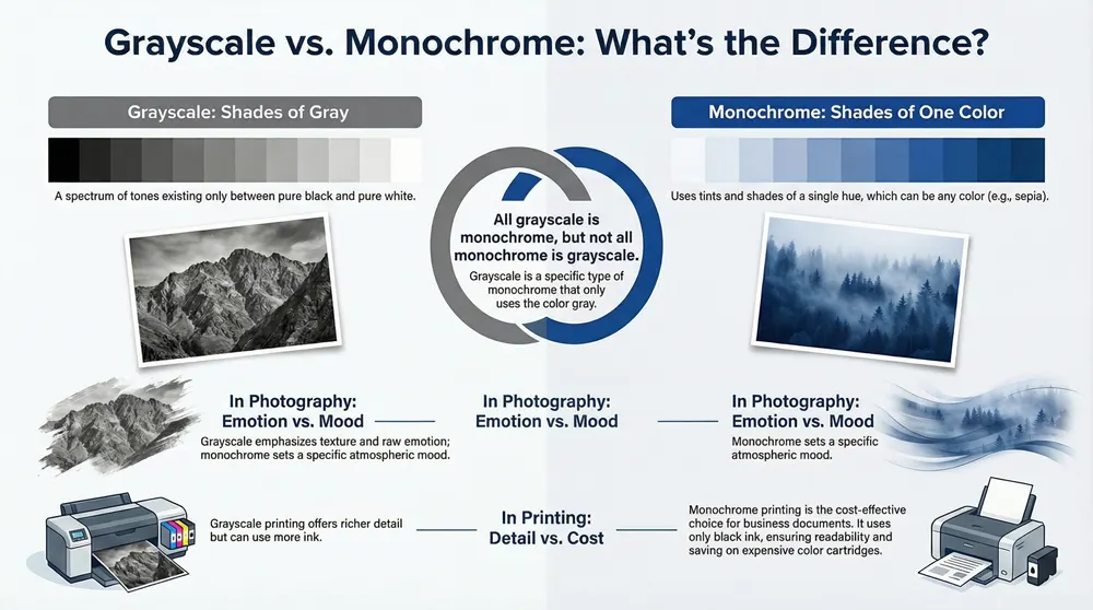
Grayscale refers to the spectrum of different shades of gray existing between black and white. In both digital photography and printing, a grayscale image represents a scene devoid of color but rich in varying intensities of gray. The transformation of a color image into grayscale is more than a mere reduction of chromatic diversity; it’s an artistic choice that emphasizes texture, contrast, and the intrinsic value of light and shadow within a composition.
The advantages of adopting grayscale in photography are manifold. Primarily, it draws the viewer’s attention to the texture, depth, and emotional gravity of the subject, unfettered by the distractions of color. This focus on contrast and texture bestows a timeless appeal and simplicity upon grayscale images, making them particularly compelling in narratives of history, identity, and raw human emotion.
In printing, the application of grayscale enhances the depth of black-and-white images. The method involves the use of black ink in varied densities to achieve a spectrum of gray alongside true black and white, allowing for a richer, more detailed rendition of the original scene.
What is Monochrome?
Unlike its grayscale counterpart, monochrome extends beyond the confines of gray, embracing the full spectrum of a single color to weave its narrative. In both digital photography and printing, a monochrome image is not limited to black and white but can incorporate any hue, offering a broader canvas for artistic expression. This singular color focus can dramatically alter the mood and focus of an image, emphasizing form, light, and texture without the distraction of a full color palette.
Grayscale vs Monochrome in Printing
In the domain of printing, the difference between grayscale and monochrome extends to the use of ink or toner. Grayscale printing uses a blend of black ink or toner with varying intensities to produce images in grayscale, capturing a wide range of gray tones. This method is ideal for reproducing images with subtle gradations, enhancing contrasting shades and finer details.
Conversely, monochrome printing typically involves using just black ink or toner to produce images. This can be more cost-effective, especially when printing black and white text where color ink or toner isn’t needed.
The choice between grayscale and monochrome settings has significant implications for both image quality and ink usage. Grayscale can offer more detailed images, especially for photographs or complex graphics. However, it may use more ink or toner, potentially increasing costs. Monochrome settings, while potentially less nuanced, require less ink or toner, particularly when using a monochrome printer that does not use color ink or toner at all. The environmental impact and cost implications of these choices are critical considerations, especially in an era of sustainability concerns.
Tips for Using Monochrome vs. Grayscale Printing
- Adjust Printer Preferences Carefully: Ensuring you select the correct printing mode is crucial for cost efficiency. Opt for monochrome printing for text documents to minimize the use of color ink, which is more expensive. Grayscale mode, while offering richer detail through the use of black and color inks for gray shades, might unnecessarily consume your color ink for documents that don’t require it. Verify your printer’s settings to see if you can default to using only black ink for grayscale printing, especially for straightforward text documents.
- Economical Use of Color Cartridges: Being strategic about when to print in color can extend the lifespan of your color cartridges, thus saving costs and reducing waste. Consider color and grayscale printing only for documents where color is essential, and adopt recycling practices for spent cartridges to support eco-friendly operations.
- Grayscale Scanning for Quality: When scanning documents or images, choosing grayscale can enhance the quality of black-and-white outputs. While monochrome scanning might save time and storage, it could compromise image quality. If storage space is a concern, consider initially scanning in color for the option to convert to black and white later, preserving the ability to revert to the original color if needed.
These strategies not only improve the efficiency and quality of your printing and scanning operations but also align with sustainable practices by reducing ink waste and encouraging recycling.
Grayscale vs Monochrome in Photography
What is a Monochrome Image?
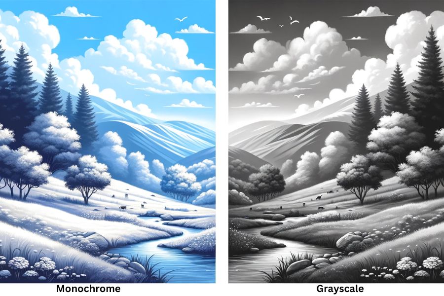
A monochrome image is essentially a single-color artwork. Originating from the Greek words “mono,” meaning one, and “chromos,” meaning color, the term suggests the image is crafted using just one hue. Unlike color photography, which captures a spectrum of colors, monochrome focuses solely on varying shades of a single color to convey depth, texture, and luminosity.

This concept is widely recognized in photography, where it is used to create compelling visuals without the distraction of multiple colors. For instance, applying a sepia tone to give photographs a classic, vintage appearance is a popular monochrome technique.
Similarly, black and white photography falls under the monochrome category because it uses shades of black (and white) to represent the image, though it is also considered grayscale due to its exclusive use of shades between black and white to depict the visual content.
What is a Grayscale Image?
A grayscale image represents a specific type of monochrome picture, characterized by its exclusive use of shades within the gray spectrum. This classification includes black and white photographs, underlining the reason these terms—grayscale and black and white—are often used interchangeably.
However, a notable distinction arises in printing contexts, where grayscale and monochrome images may necessitate different ink types for accurate reproduction. This differentiation is typically accessible through a printer’s settings, allowing for appropriate adjustments based on the desired output.
Monochrome Vs Grayscale Photography Comparison
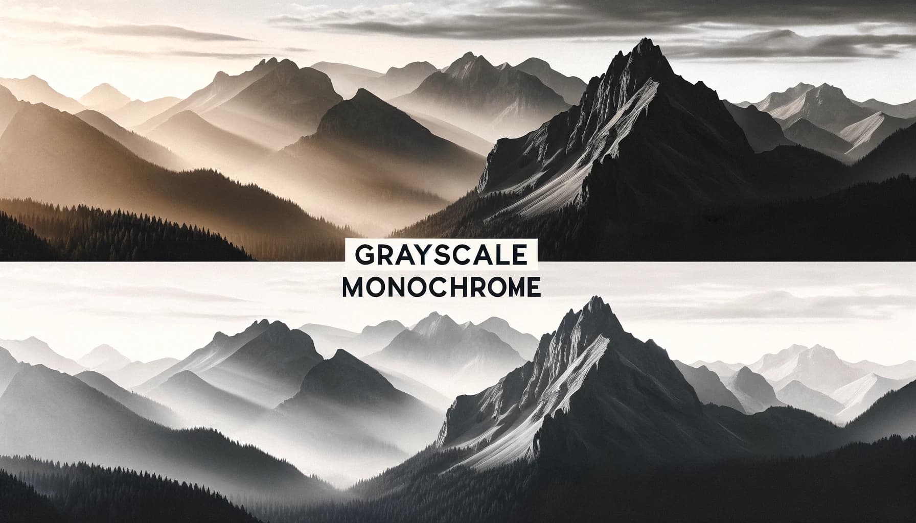
When peeling back the layers of grayscale and monochrome in photography, we uncover distinct landscapes of expression and technique. Grayscale photography captures a spectrum from pure black to pure white, rich in different shades of gray. It strips away the hues to focus solely on light, shadow, and texture. This absence of color magnifies the emotional gravity, drawing viewers into the depth of the image.

Monochrome photography, in contrast, employs a single color – not just black and white but potentially any color – adding a layer of mood or atmosphere that color photography often seeks to convey.
Creating these images involves both in-camera settings and post-processing. Many digital cameras offer a black and white mode, allowing photographers to shoot directly in grayscale or monochrome. This in-camera method provides an immediate sense of the final image but limits flexibility in editing. Post-processing, on the other hand, offers boundless creative control, enabling photographers to convert a color image into grayscale or apply a color filter for a monochrome effect.
The Hybrid Method: Combining Techniques for Optimal Results
The hybrid technique in photography combines the straightforwardness and instant results of capturing images in black and white directly through the camera with the extensive creative options available through post-processing.
This approach allows photographers to preview and capture the world in monochrome or grayscale, directly through their viewfinder, thus making informed compositional choices that consider the interplay of light and shadow without the distraction of color. Afterward, the raw color data retained in the file affords them the flexibility to fine-tune the image, adjust contrasts, and even explore different monochromatic hues or revert to the original colors if desired.
What People Also Ask
Is monochrome the same as black and white?
No, monochrome encompasses more than black and white photographs. It refers to images made of shades of a single color, which can include black and white but also extends to other colors, offering a broader palette for creative expression.
Can you convert a color image to monochrome and grayscale?
Yes, a color image can be transformed into both monochrome and grayscale. This conversion is often achieved through post-processing, allowing for a transition from the vibrant spectrum of color photography to the more focused aesthetics of monochrome or the nuanced tones of grayscale.
What are the benefits of grayscale photography over color?
Grayscale photography excels in highlighting textures, patterns, and contrasts, stripping away the distraction of color to focus on the fundamental aspects of composition and lighting. This often results in images that convey a stronger emotional tone or a sense of timelessness compared to their color counterparts.
Why choose monochrome printing for business documents?
Choosing monochrome printing for business documents is primarily a matter of cost efficiency and readability. Black text on a white background ensures high legibility, while the use of black ink or toner alone is more economical than the color printing, especially for high-volume tasks where color is not essential.
Conclusion
In conclusion, the choice between the two, whether in capturing moments or committing them to print, hinges on the desired aesthetic outcome and the message the creator wishes to convey.
Above all, understanding the key differences between grayscale and monochrome—and when to employ each—enables artists and professionals to harness these techniques to their fullest potential, matching their choice to their artistic goals or printing needs.


